DATA VISUALISATION FOR ENTREPRENEURIAL LEARNING
Accelerate your business with these expert tips on "Data Visualisation for Entrepreneurial Learning". Analyse and discover this TIP!
Data visualisation is a powerful tool that mentorDay uses to help entrepreneurs understand and leverage key information related to their business. Through graphs, charts, diagrams and other visual elements, complex data is transformed into clear and concise visual representations.
mentorDay provides entrepreneurs with data visualisation tools that allow them to explore and analyse information relevant to their business. These tools allow them to see patterns, trends and relationships that may not be evident in raw data. By presenting information visually, it makes it easier to understand and identify key information.
Data visualisation can help entrepreneurs make more informed and strategic decisions. By seeing data represented graphically, entrepreneurs can identify opportunities, pinpoint areas for improvement and assess the performance of their business. In addition, data visualisation helps to communicate information effectively to other team members, investors or business partners.
Some of the data visualisation techniques used by mentorDay include
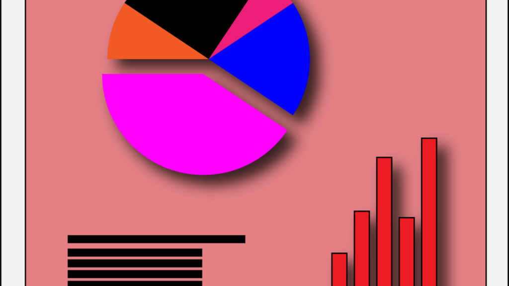
- Bar charts: These graphs show the comparison of different categories or variables using rectangular bars. They are useful for visualising quantitative data and comparing values.
- Pie charts: Pie charts represent proportions and percentages using sectors of a circle. They are useful for showing the distribution of data in different categories.
- Scatter diagrams: These diagrams show the relationship between two variables using points on a Cartesian plane. They help to identify correlations and patterns in the data.
- Heat maps: Heat maps use colours to represent the density or intensity of data in a given geographic area. They are useful for visualising spatial or geographic data.
- Line diagrams: Line plots represent the evolution or trend of a variable over time. They are useful for showing changes and patterns in sequential data.
- Infographics: Infographics are visual representations that combine text, graphics and visual elements to communicate information clearly and concisely. They are useful for summarising complex data and telling a visually appealing story.
These are just some of the data visualisation techniques used by mentorDay. Each of them is selected based on the data and the specific needs of the entrepreneurs. The ultimate goal is to provide entrepreneurs with a clear and meaningful view of the data so that they can make informed and strategic decisions in their businesses.
Here are some practical examples of data visualisation in the context of entrepreneurship:
- Bar chart: Suppose an entrepreneur is analysing the monthly sales of his product in different regions. He can use a bar chart to represent the total sales for each region in a specific month. The bars will visually show the differences in sales and allow the entrepreneur to identify the most successful regions and those that require additional attention.
- Pie chart: Imagine an entrepreneur wants to communicate the distribution of his operating expenses in different categories. He can use a pie chart to show what percentage of the budget is allocated to each category, such as marketing, personnel, product development, etc. This type of visualisation will allow the entrepreneur to quickly understand how resources are distributed and whether adjustments need to be made. This type of visualisation will allow the entrepreneur to quickly understand how resources are distributed and whether adjustments need to be made.
- Scatter diagram: Suppose an entrepreneur is analysing the selling price of his products in relation to customer satisfaction. He can use a scatter plot to represent each sale as a point on a graph with the X-axis representing customer satisfaction and the Y-axis representing the selling price. This will allow the entrepreneur to identify any relationship between price and customer satisfaction, which could help in pricing and improvement strategies.
- Heat map: Imagine an entrepreneur is looking to expand his business and wants to identify the geographic areas with the highest demand for his product. He can use a heat map to visualise the areas with the highest density of potential customers or sales. The heat map will visually show the regions with the highest interest in their product, which can help the entrepreneur make more informed decisions about where to focus their expansion efforts.
- Line diagram: Suppose an entrepreneur is tracking the growth of his social media followers over time. He can use a line diagram to represent the number of followers on the Y-axis and time on the X-axis. This visualisation will clearly show the evolution of follower growth and allow the entrepreneur to identify trends and patterns over time.
These are just a few practical examples of how entrepreneurs can use data visualisation to better understand their business, identify opportunities and make informed decisions. The choice of visualisation technique will depend on the specific data and objectives of the entrepreneur. It is important to select the appropriate technique that highlights the most relevant information and is easily understood by the target audience.
Here is a list of some popular data visualisation tools, along with their price, subscription link and some advantages and disadvantages:
TABLEAU
- Price: offers different pricing options, including monthly and annual subscription plans, as well as team and corporate plans.
- Link: You can find more information and subscribe on their official website (see+).
- Advantages: is a powerful and versatile tool that offers a wide range of data visualisation capabilities. It allows the creation of interactive visualisations, dashboards and offers advanced analysis options.
- Disadvantages: The learning curve can be steep for novice users. Some advanced functionalities may require additional technical knowledge.
POWER BI
- Price: offers different plans, including a limited free version and monthly and annual subscription plans for individual and corporate users.
- Link: You can get more information and subscribe through the official Microsoft website (see+).
- Advantages: is a powerful and easy-to-use data visualisation tool. It integrates well with other Microsoft tools and services, such as Excel and Azure. It offers a wide range of data visualisation and analysis options.
- Disadvantages: Some advanced functionalities may require technical knowledge. The free version has some limitations in terms of storage capacity and collaboration.
GOOGLE DATA STUDIO
- Price: is a free tool offered by Google.
- Link: You can access to start using it by clicking on the following link link (see+).
- Advantages: is easy to use and offers seamless integration with other Google tools such as Google Sheets and Google Analytics. It allows you to create interactive and customised visualisations.
- Disadvantages: Some advanced functionality may be limited compared to more robust data visualisation tools. Does not offer advanced data analysis options.
QLIKVIEW
- Price: offers different pricing options, including monthly and annual subscription plans.
- Link: You can obtain more information and request a demonstration through their official website (see+).
- Advantages: is a powerful and highly interactive data visualisation tool. It allows flexible data exploration and offers advanced analysis and modelling options.
- Disadvantages: Can have a steep learning curve for novice users. Price may be higher compared to other data visualisation tools.
It is important to note that prices and features of tools may change over time. I would recommend visiting the official websites of each tool to get the most up-to-date information on pricing and specific features. In addition, I suggest you assess your specific needs and objectives beforehand.
Clara is an entrepreneur who is looking to improve her learning and understanding of data related to her business selling electronic products. She has decided to use data visualisation tools to gain better insight into her performance and make informed decisions.
The following is a case study of how Clara uses these tools:
- Clara starts by using Google Analytics to track traffic and visitor behaviour on your website. With this tool, you can access detailed data on the number of visitors, time spent on your site, most popular pages, traffic sources and more. Clara creates a customised dashboard in Google Data Studio, where you can graphically visualise this data in the form of interactive charts and tables. This allows you to have a clear view of how your website is performing and which areas may require improvement.
- Clara also uses an Excel spreadsheet to track its monthly sales and product inventory. It uses different types of graphs, such as bar charts and pie charts, to visualise sales trends and the most popular product categories. This helps you identify which products are in high demand and which need further promotion. Clara can adjust its marketing and inventory management strategy based on these visualisations.
- To better understand the performance of her social media marketing campaigns, Clara uses a social media analytics tool such as Hootsuite. With this tool, she can track the reach of her posts, user engagement and follower growth. Clara uses line graphs and bar charts to visualise key metrics for her social networks. This allows you to identify which content and strategies work best and adjust your approach to maximise the impact of your campaigns.
- Clara also uses Tableau to analyse the demographics and buying patterns of your customers. With this tool, you can create interactive visualisations based on your sales data, such as the age, gender and location of your customers. Clara can identify specific customer segments and customise your offers and marketing strategies to meet their needs. In addition, you can visualise the relationship between different variables, such as price and customer satisfaction, to make more informed decisions based on these insights.
In a nutshell, Clara uses a variety of data visualisation tools, such as Google Data Studio, Excel, Hootsuite and Tableau, to enhance her learning and understanding of data related to her business.
These tools allow you to effectively visualise different aspects of your business, such as website traffic, sales, social media performance and customer demographics. Using these visualisations, Clara can identify patterns, trends and opportunities to make more informed decisions and optimise your business.
APPLY THIS TIP TO YOUR PROJECT
- 💻 PRACTICE with an expert in the next practical webinar.
- 🔎 CONSULT more related TIPs with this same theme.
- 📖 AMPLIA your knowledge by downloading this EBOOK.
THINK ABOUT YOU
- 🚀 IMPULSA your company in the next acceleration programme, ¡book your place now!
- 🥁 PRACTICE with your project in this practical webinar, ¡apply for your place!.
- 🌐 CONTACT with other entrepreneurs and companies, ¡register and take part in the next Networking!
THINK ABOUT HELPING OTHERS
- 🤝COLLABORATE as a volunteer: expert, mentor, inverter, awarding, Spreading the word, challenging, innovating, creating a TIP...
- 💬 RECOMMENDS this programme to reach out to more entrepreneurs by Google.
- 👉 SHARE your learning!
- 📲 SEND this TIP 👇
Rate this TIP!
Click on the stars to rate
Rating "1" - Average " - Average5"
No votes yet, be the first to vote!
We are sorry you did not find it useful.
Help us improve this TIP!
Leave us a comment and tell us how you would improve this TIP